Both rem and px are commonly used units in web design. At first glance, they can give you the same result — but that’s just an illusion.
In reality, the difference between these two units is significant in terms of web accessibility, and there are very few cases where you should use px over rem. Here’s why.
The Problem With Using Pixels on the Web
Pixels are an absolute unit with a fixed value: 1 pixel will always equal 1 pixel. This rigidity may seem like a good thing — it lets you design with precision, “pixel-perfect.” But shouldn’t a tailored design be one that also adapts to users’ preferences? That’s our definition of good design. And that’s where px becomes a problem.
Since 1 px stays the same no matter the context, elements sized in px don’t adapt to users’ preferences. Using pixels on a website or app can cause two main issues:
- Barriers to web accessibility (e.g., doesn’t adapt for visually impaired users)
- Lack of flexibility in responsive design
rem: The Solution?
rem (root em) is a unit that adapts to the user’s resolution and settings. While it defaults to 1rem = 16px, this value changes based on browser preferences.
In practice, 1rem might render visually as 24px, for example. For text sizes, this means bigger, more readable fonts when needed.
Examples of rem in Use
You’ve likely already seen rem in action. Take the iPhone for example: message and email text sizes can vary from one user to another. That “zoom effect” is adaptive display, based on user preferences. It’s a great illustration of how rem works.

Advantages of rem
Using rem improves accessibility — and it goes even further. In addition to making your site more inclusive, rem enables advanced techniques like fluid responsive design, automatically adjusting to each screen width with ease.
REM vs Pixels
→ Better user/visitor experience
→ More flexibility in responsive design
Example of custom CSS integration to quickly and at scale make a site fluid responsive, if built using rem units.
<style>
  html { font-size: calc(0.625rem + 0.41666666666666663vw); }
  @media screen and (max-width:1920px) { html { font-size: calc(0.625rem + 0.41666666666666674vw); } }
  @media screen and (max-width:1440px) { html { font-size: calc(0.7498262682418346rem + 0.27797081306462823vw); } }
</style>
Is Your Site Adaptive? Test It.
Does your website follow best practices and adapt to user preferences?
You can easily test how adaptive your design is:
- Open your browser settings
- Go to the Appearance tab
- Change the font size
- Go back to your site
- Check what changes

📝 Note: You can also test your competitors’ sites.
If they use rem and adapt, they have an undeniable advantage over you. If not… it’s your chance to stand out 😉
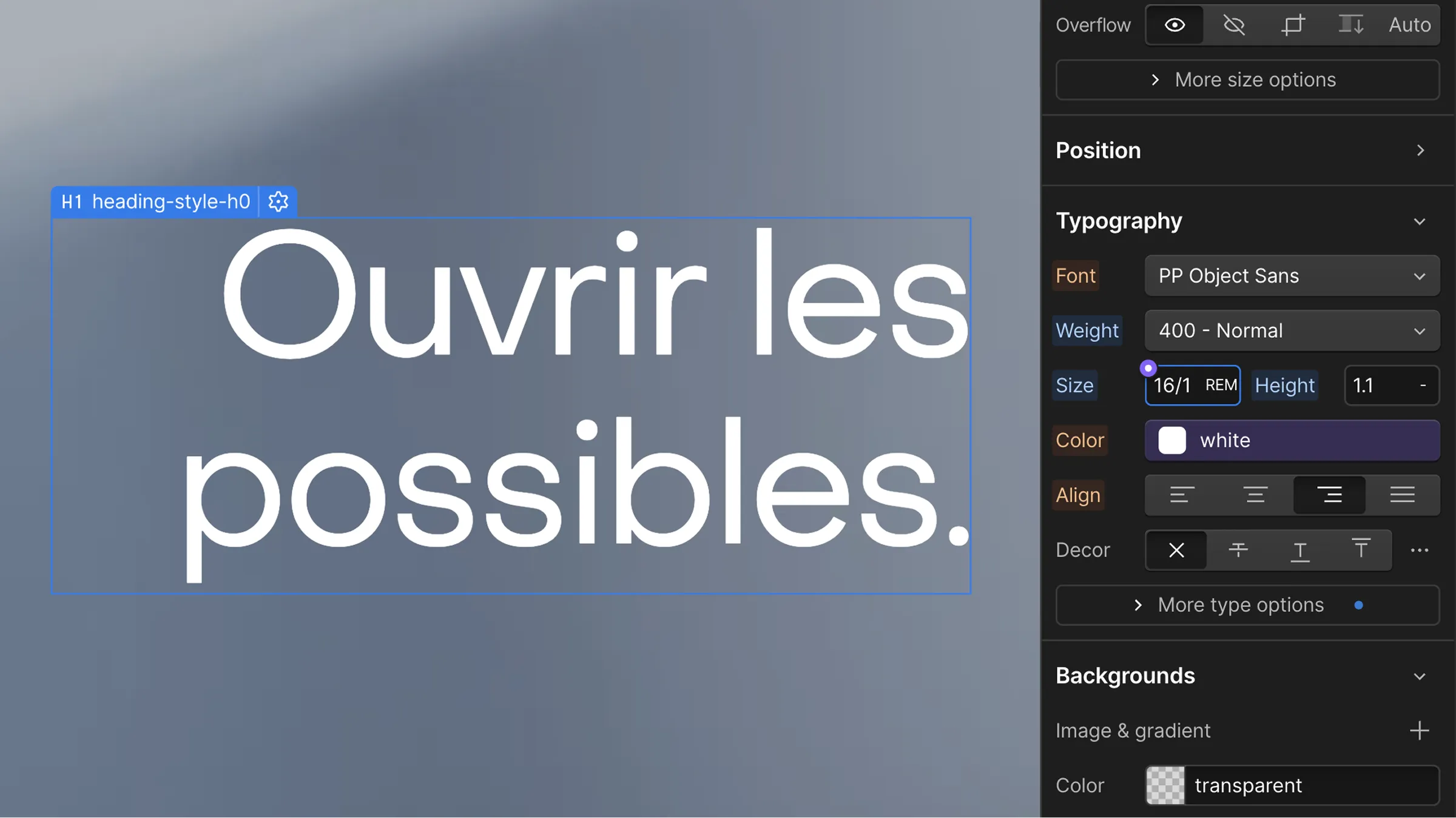
How to Convert Pixels to rem?
Figma is the reference tool for UI design — but most designers don’t use rem, since it’s a unit more common in development. To keep it simple, just remember the conversion ratio:
1 rem = 16 pixels
So divide your pixel values by 16. Example: 32px font size = 2rem → 32px / 16 = 2rem
You can also use plugins or tools to convert at scale.
How to Use rem in Webflow?
If you’re building your site with Webflow, it’s even easier.
Webflow lets you convert pixel values directly inside the Designer:
- Enter your pixel value (e.g., 16)
- Add /16 → becomes 16/16
- Add the rem unit and hit Enter → 16/16rem
- Webflow will auto-convert the value
📝 Note: You can also use extensions like Potato Extension for Webflow to do it automatically.
Key Takeaways
- Web accessibility is essential for site performance
- Even if px and rem look the same visually, they are fundamentally different
- There are very few scenarios where you should use px in modern web dev
- Use px only for ultra-precise elements (borders, etc.)
- Use rem for everything else: text, margins, paddings, images…→ for a site that adapts to your visitors’ preferences


.jpg)