Introduction
Modals (or pop-ups) are essential elements in the web world. They can display additional content, present calls to action that will undoubtedly catch your visitors' attention, and when used wisely, they can be an effective way to optimize the conversion rate of your pages.
In this article, I will show you how to create a custom modal in Webflow without needing to dive into code. Let's get started! 🚀
1) What is a modal?
First, let's take a moment to understand what exactly a modal is and why it can be so beneficial for our websites.
A modal is a pop-up window that appears on top of the main content of a web page. It can either be triggered automatically after a certain time or after an action is performed on a trigger (like clicking a button).
One of the main advantages of modals is their ability to focus visitors' attention on a specific element without requiring them to leave the page.
Imagine a Testimonials section on your website: instead of overwhelming your page with lengthy testimonials, you can display catchy snippets with a button for more information. When a visitor clicks this button, a pop-up opens, presenting the full testimonial with additional details.
This approach allows your visitors to get an overview and then dive deeper into detailed content if they're interested.
5 original uses for pop-ups
2) How a modal works on a web page
But before we dive into creating our modal on Webflow, let's first see how it actually works.
In simple terms: a modal is a hidden element on the page until a specific action triggers its appearance (usually a click on a button). When you activate this trigger, an interaction in Webflow changes the modal from a hidden state to a visible state.
Finally, we also add a “Close” button inside the modal. When you click this button, another interaction is triggered, hiding the modal again and allowing you to resume browsing the page.
To ensure the modal remains visible, even when scrolling, we will use the CSS property “position: fixed” to keep the element fixed with respect to the browser window. Therefore, even if you scroll, it will always remain in place.
Now that we know how our modal will function, let's dive into the next part to explore in detail how to create and customize this feature on Webflow!
3) Create the modal structure in Webflow
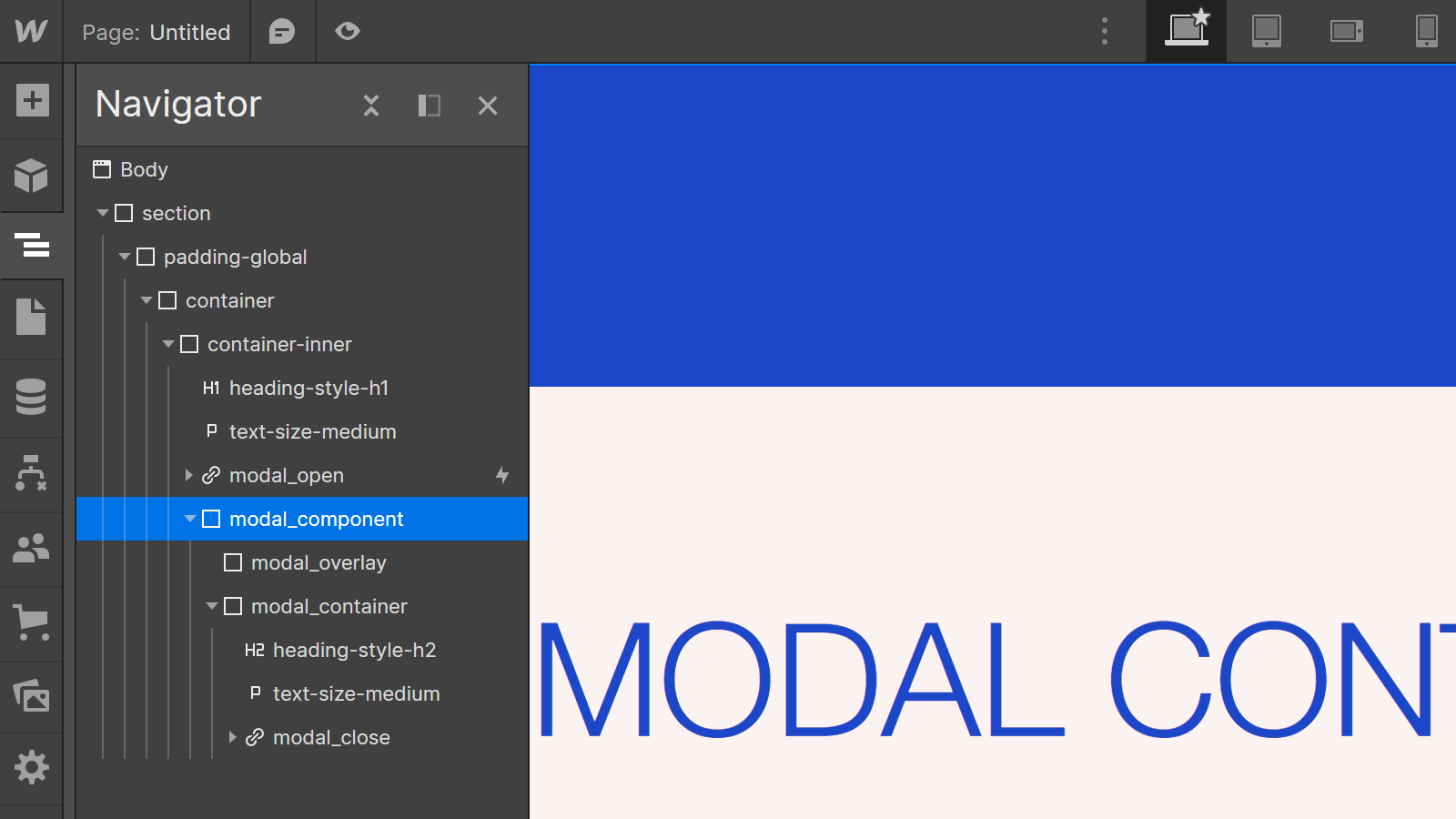
Let’s get practical in Webflow. First, set up the basic structure of the component:
1) Add a Div Block that will encompass all the elements of your modal and facilitate easy management of the component.
- Give it a class (e.g., "modal_component").
- Set its position to "Fixed" so it remains visible during scrolling, and set this position to “Full” to cover the entire screen.
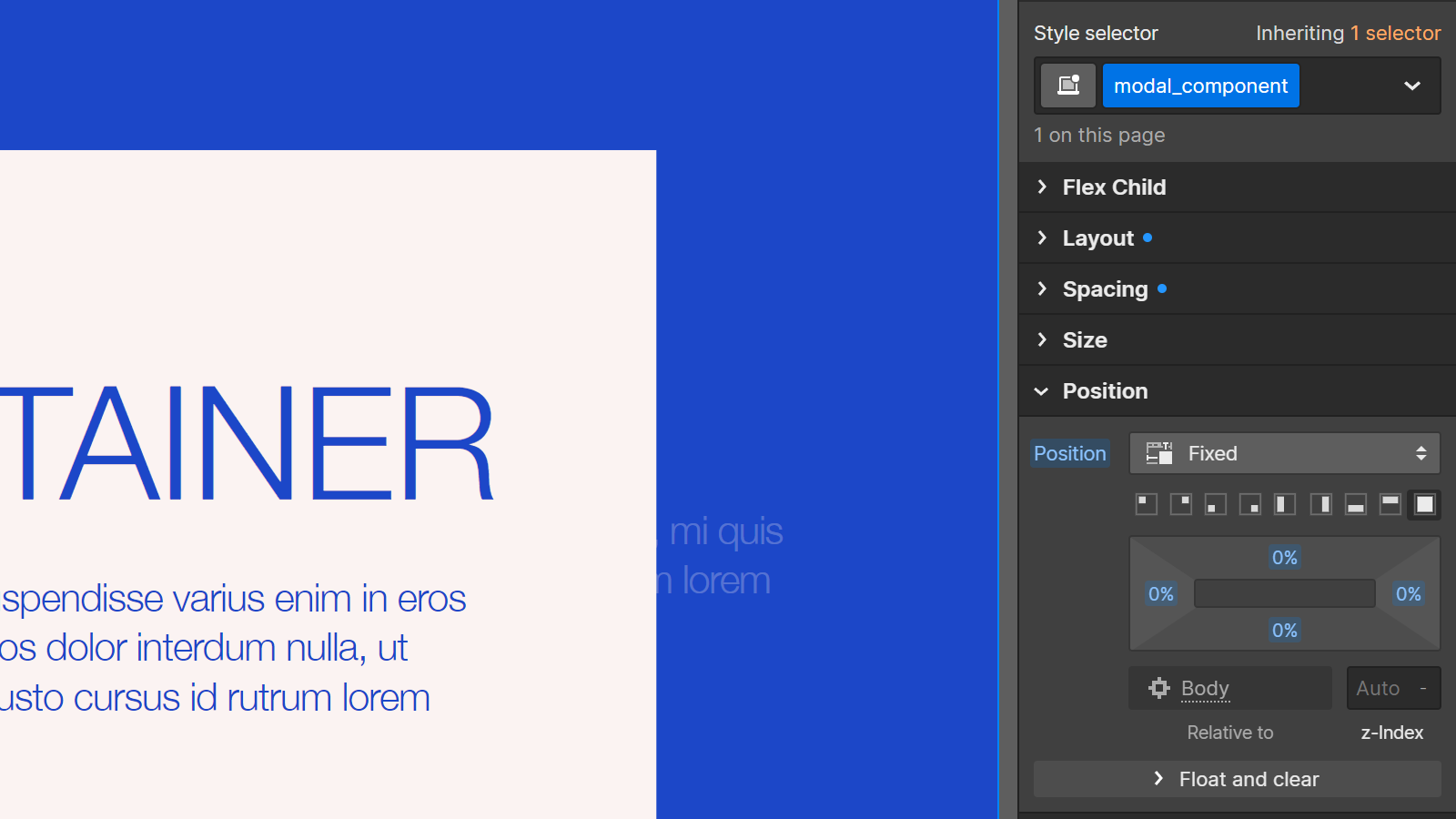
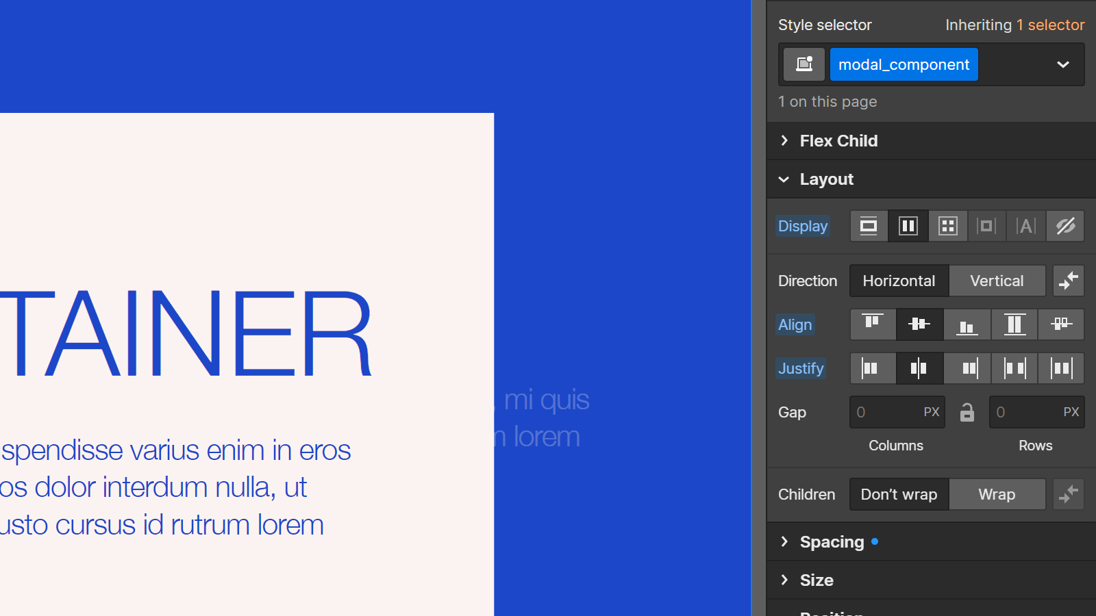
- Ensure that the child elements are centered using “Flexbox.”
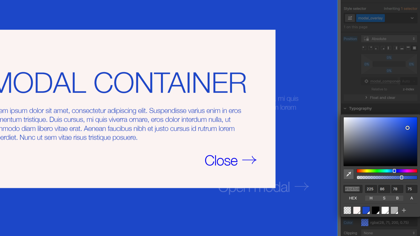
2) Inside the “modal_component,” create a first Div Block that will serve as the background (or overlay).
- Give it a class (e.g., “modal_overlay”).
- Set its position to “Absolute” and define this position as “Full” to cover the entire component.
- Assign it a dark background color with reduced opacity to darken the content of the page (e.g., #1C47C8 at 25% opacity).
3) Inside the “modal_component,” create a second Div Block for the modal itself; this is where you will add the pop-up content.
- Give it a class (e.g., “modal_container”). Set it with a “Relative” position and a high z-index so that it is not obscured by the overlay or other elements on the page.
- Assign it a background color so that its content is clearly visible (e.g., #FFFFFF) and customize its style according to the desired design (width, border-radius, etc.).
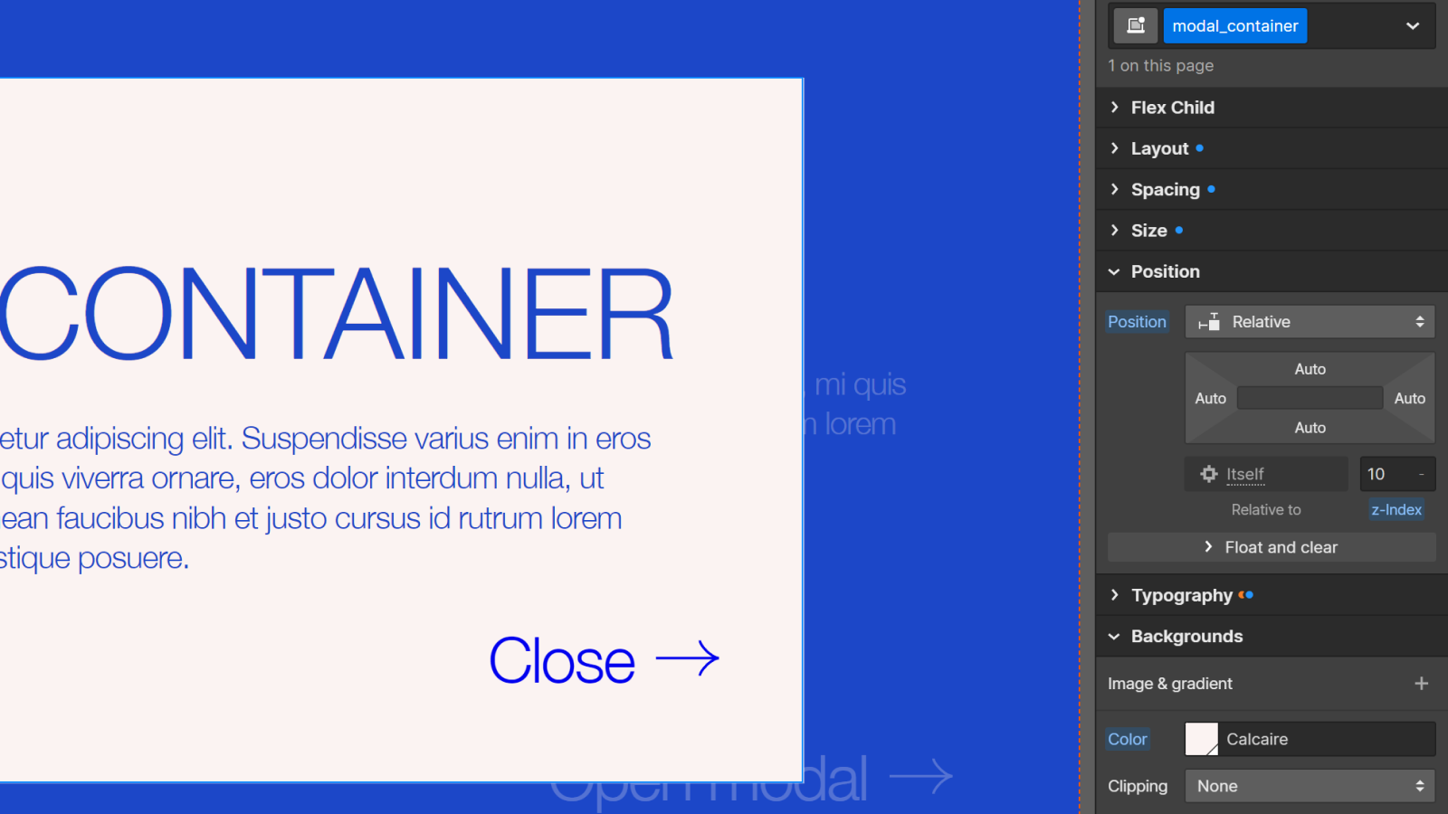
- Then, add the desired elements: text, images, buttons, or forms.
4) Inside the “modal_component” or the “modal_container,” add at least one element to allow the user to close the modal, such as a "Close" button or an icon in the upper right corner.
5) Once your structure is set, set the .modal_component to “Hide” so it doesn’t appear when the page loads.
4) Create the interaction to show or hide the modal
Now that the modal structure is in place, let's add the interactions that will make the modal functional.
1) Create the opening interaction for the modal.
- Select the button or element you wish to use to trigger the opening of the modal.
- Go to the "Interactions" tab of the element, click the "+" button in the Element Trigger tab to add a new interaction, and select the “Mouse click” event.
- Choose whether you want to assign the interaction just to the selected element or to all elements with the same class, and create an “On first click” interaction.
- Select the modal component in the navigator, add a “Hide/Show” action and set it to “Flex” to display the modal when the button is clicked.
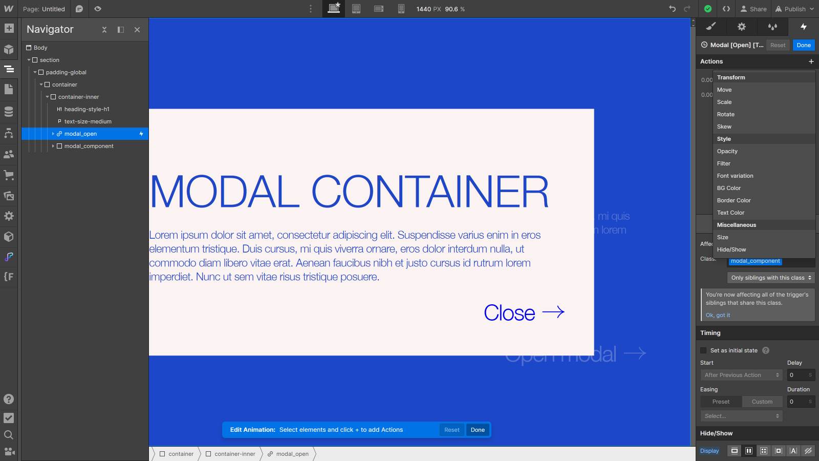
- If you want to make the animation smoother, you can enhance this basic interaction by playing with opacity and/or moving the modal, for example.
2) Create the closing interaction for the modal.
- Select the close button inside the modal and add a click interaction to it (similar to the opening interaction).
- Select the modal component in the navigator, add a “Hide/Show” action and set it this time to “Hide” to conceal the modal when the close button is clicked.
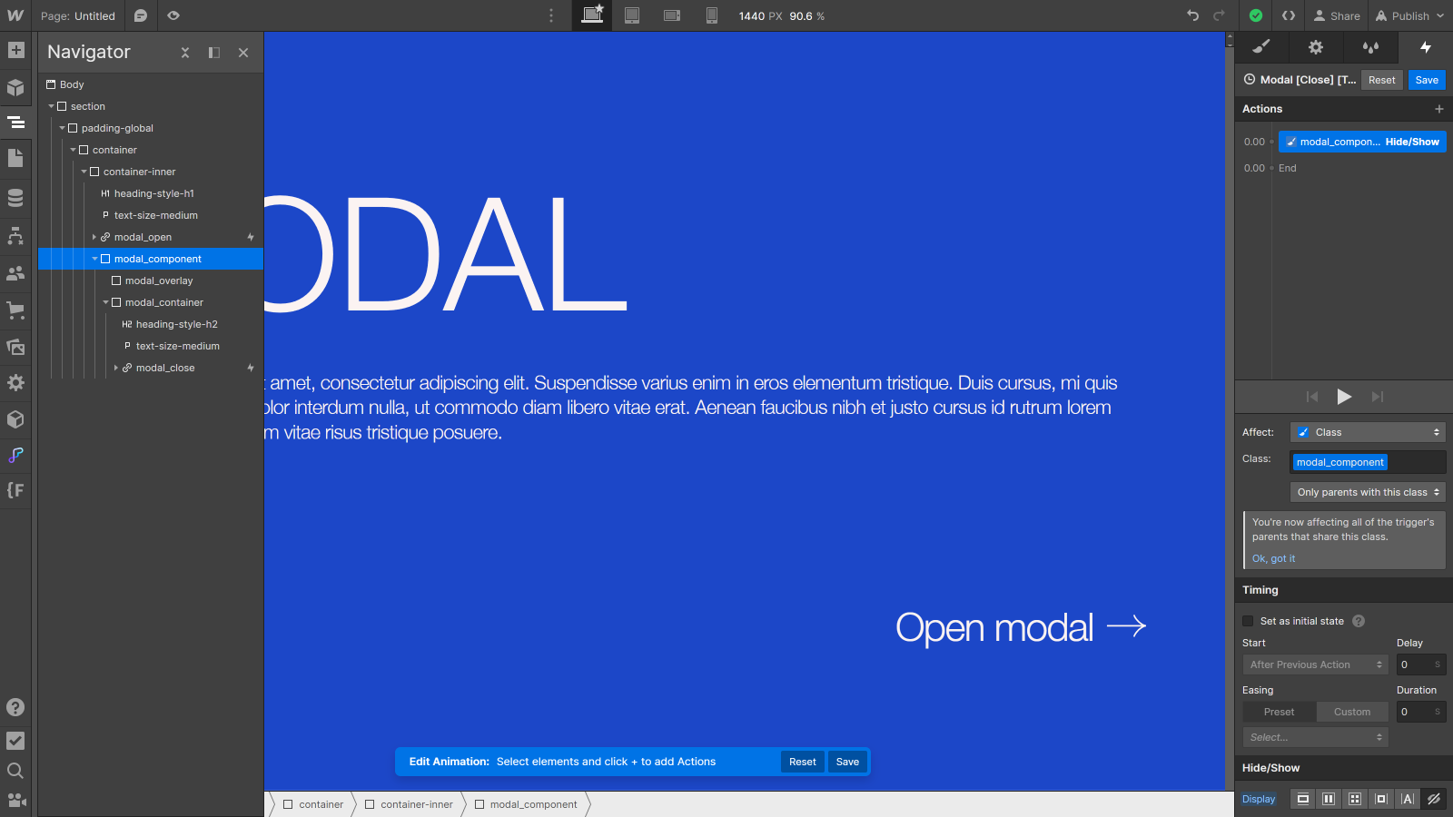
- Again, if you want to make the animation smoother, you can enhance the basic interaction with opacity and/or movement effects.
By adding these interactions, you transform your basic structure into an interactive modal component that can be opened and closed in response to user actions. Don't forget to test the modal in preview mode to ensure all interactions work correctly.
5) Enhance the modal component with Finsweet attributes
To take your modal even further and provide an optimal user experience, you can leverage some advanced features of Finsweet attributes. Two particularly useful attributes are "Mirror Click Events" and "Disable Scrolling".
Mirror Click Events
The "Mirror Click Events" attribute allows a click on one class to automatically trigger a click on another class. When the modal is open, this feature can ensure that a click on the overlay is also recorded as a click on the close button. This means your users can close the modal by clicking anywhere outside the modal content itself, significantly improving accessibility and user experience.
How to do it?
- Paste the script into the head code of your page, in the custom code:
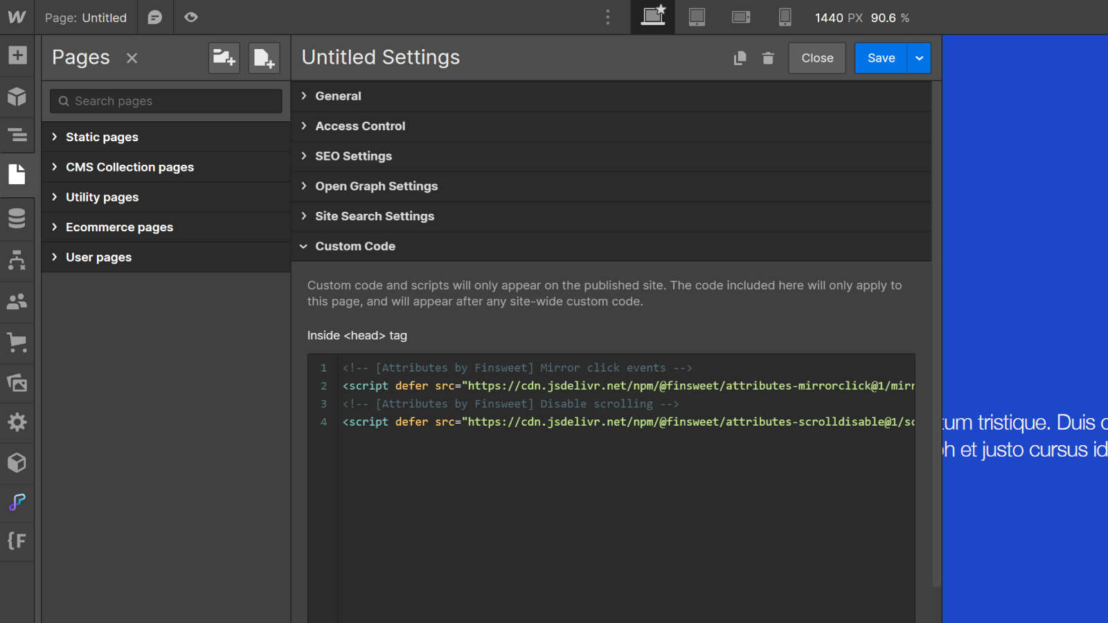
- Add a custom attribute fs-mirrorclick-element:”trigger” to your background.
- Add a custom attribute fs-mirrorclick-element:”target” to your “Close” button.
Disable Scrolling
The "Disable Scrolling" attribute allows you to enable/disable when a class is clicked. By enabling this attribute when the modal is open, you effectively suspend scrolling on the background page. This prevents the user from scrolling the page beneath the modal, ensuring they remain focused on the modal content and enhancing their focus on the ongoing interaction.
How to do it?
- Paste the script into the head code of your page, in the custom code:
- Add a custom attribute fs-scrolldisable-element:”disable” to your opening button.
- Add a custom attribute fs-scrolldisable-element:”enable” to your close button.
Adding these attributes will help enhance the overall user experience by providing smooth and effortless interactions.
Conclusion
Creating a custom modal may seem complex at first glance, but with the right tools and an understanding of the necessary structure and interactions, you can easily add them to your websites. Modals provide an effective way to display additional information or allow users to perform specific actions while maintaining smooth navigation and a good user experience.
By following the steps we explored, from setting up in Webflow to customizing style and interactions, you now have all the keys to create and integrate custom modals that perfectly fit your needs and design.
Want to learn more web design tips like this?
- Follow us on our YouTube channel for more guides and advice,
- Continue to learn, experiment, and innovate with the Digidop Academy,
- Check out one of our latest blog articles: The new "Site Builder" AI from Relume


.jpg)
