When creating a website, you probably want to have complete control over the design of your pages. Fortunately, this is achievable with Webflow. Webflow is a tool designed specifically for web design (and more 😉). When you create a Webflow project and develop your website, you can control everything. This allows you to have your imagination as the only limit.
Today, we will once again explore the enormous design possibilities of Webflow by discussing positioning. Positioning elements freely allows for the creation of modern and customized websites. In this article, we will focus on the 6 types of positions that can be applied to elements in Webflow.
P.S.: You can change an element's position type in the specific tab of the Style Manager in the Designer.
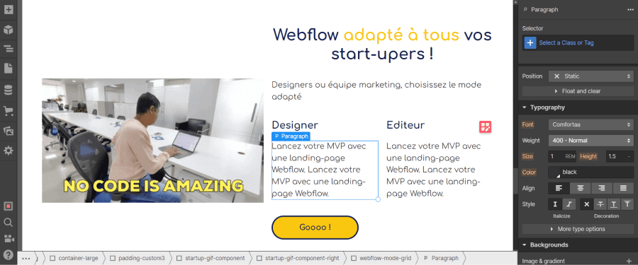
1. Static Position
Static position is the default position in Webflow. This type of position allows you to place elements in the exact order in which they were laid out. Depending on the defined display type (layout), they will appear one below the other, side by side, in a grid, etc.
Thus, in a static position, elements have a defined place and will not overlap with other elements.
2. Relative Position
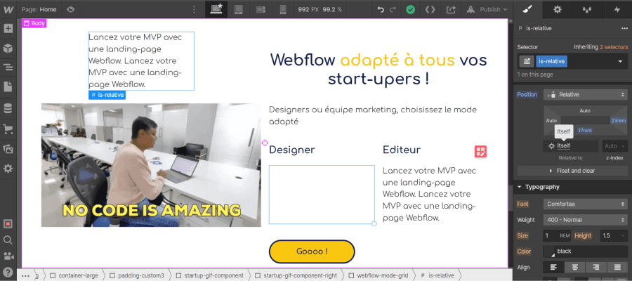
The relative position in Webflow is quite similar to the static position. The main difference is that the relative position can be moved in different directions (up, down, left, right) from its base position without affecting the positioning of other elements.
In this specific context, we can say that the element is relative to itself. It is relative to its default (static) position. This is illustrated in the small box labeled "relative to": "itself".
You can position your element using the position editor. Simply provide values for the various directions. The values can be specified in pixels, percentages, ems, rems, vh, vw or left as auto.
It is important to note now that for the upcoming positions, the relative position will act as a sort of reference. To clarify, an element in relative position will frame the descendant elements in absolute, fixed, or sticky positions. These descendant elements will be positioned based on the closest parent element that is set to relative.
In addition to the position editor and the "relative to" box, there is a box for setting the z-index.
What is z-Index?
The z-Index represents a sort of third dimension in web development. We have seen that we could move an element's position vertically (up and down) and horizontally (left and right). With the z-Index, we introduce a new axis for moving the element in front of or behind (on a 3D plane).
To be more precise, the z-index controls the stacking (in front of or behind) of what we see behind our screen. Thus, it is possible to define which element should be in front of or behind another if they overlap.
It is worth noting that with the exception of a negative z-index value, your elements will always appear in front of static elements.
3. Absolute Position
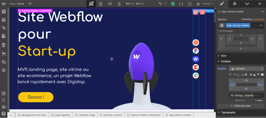
The absolute position gives us even more flexibility and options regarding the positioning of our Webflow elements. Just like the relative position, absolute position allows for free movement of the element on your page. In this case, the position of your element does not affect the position of other elements, and your element is not affected by the other elements (in positioning terms). It’s as if your element is outside of your page.
By default, when you choose this position type, your element is positioned concerning your entire page (body). It is said to be relative to the body element.
However, you can position your absolute element based on another element (within it). To do this, you must set the relative position on the ancestor whose position you want to frame for your absolute element. Be careful, if two ancestors have a relative position, the absolute element will be relative to the closest parent in the hierarchy (Everything to know about the hierarchy of elements in Webflow).
Webflow Tips: You can easily determine which element your absolute element is relative to by looking in the "relative to" box.
The position is defined through the position editor (top, bottom, left, right), and the z-index determines which element takes precedence. There are also predefined layouts.
4. Fixed Position
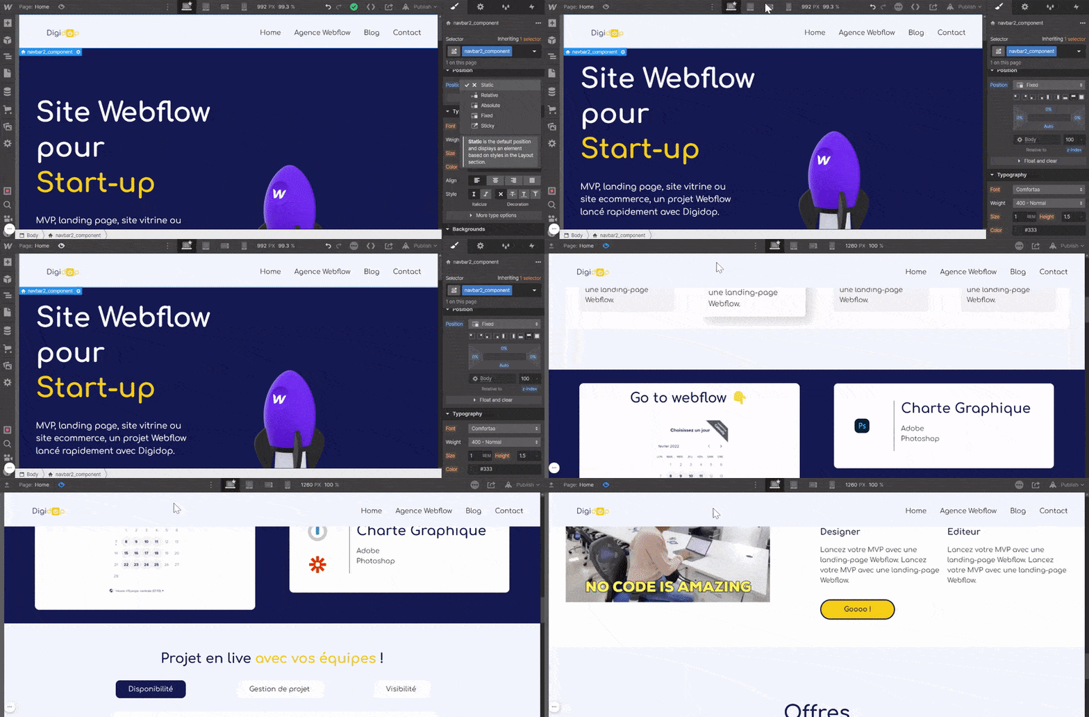
The fixed position in Webflow once again pushes the boundaries of the previous positions. First, it is important to note that elements with fixed positioning are positioned relative to the browser's viewport. The viewport is the part of the browser that contains everything visible on the screen at a given “t” moment.
An element with fixed positioning follows 2 rules:
1. The element is no longer part of the document flow (like the absolute position)
2. The element remains in its designated position even when scrolling
A fixed element stays in place as defined, regardless of interaction. This position can be particularly useful for navigation bars, for instance.
You can, of course, set a custom position using the position editor or use predefined layouts.
5. Sticky Position
The sticky position is another type of positioning in Webflow. To use Webflow's terminology, a sticky element is “relative to the document flow until a scroll position is reached. Once that position is reached, the element takes a fixed position within its parent element.”.
In summary, an element with a sticky position will have a positioning that scrolls along with you until you reach the next section.
For the sticky position to apply to your element, you must specify at least one position value (top, bottom, right, left). The position value defines the point at which your element will take a relative position.
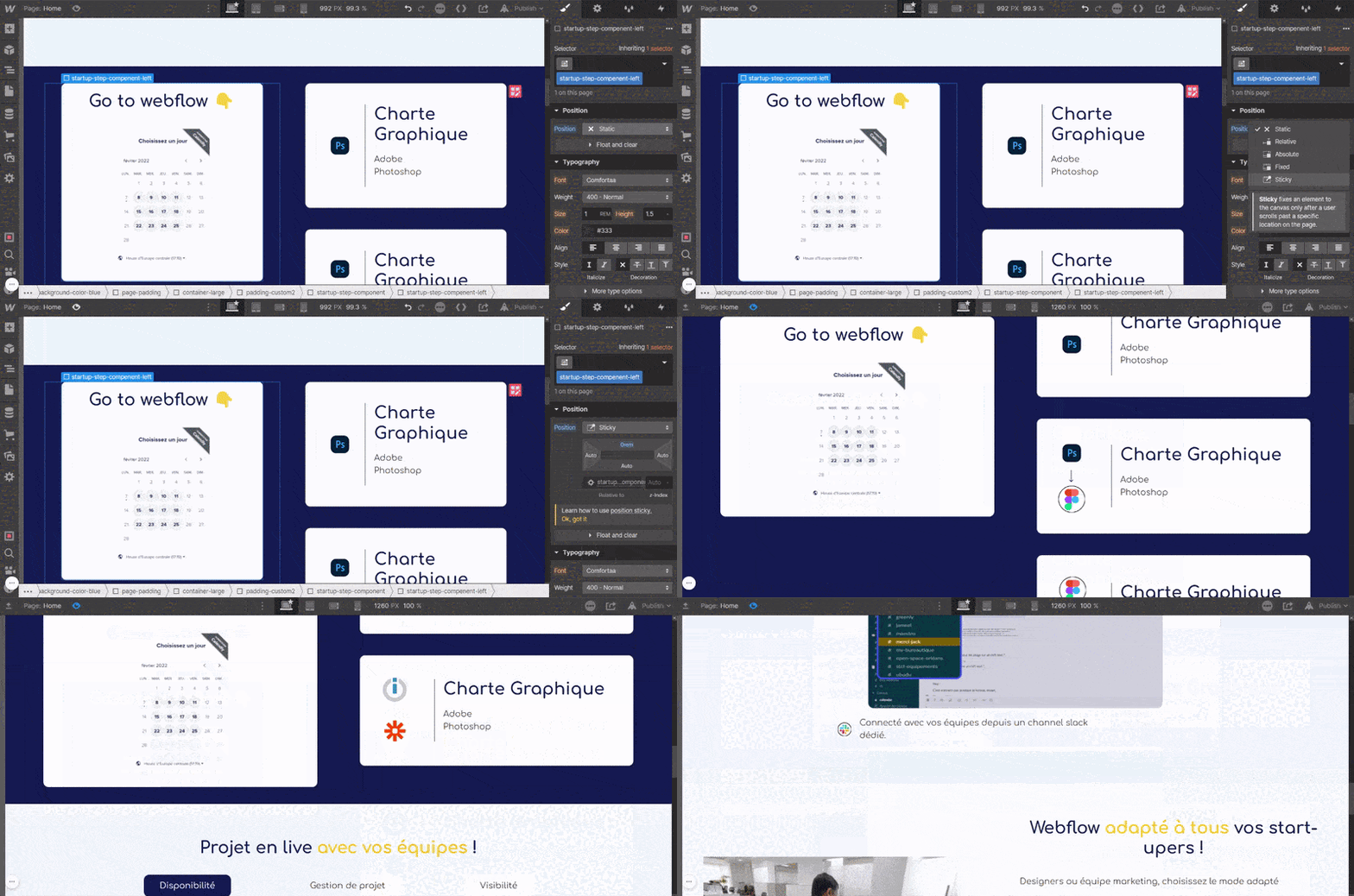
Useful tutorial 👉 Position a sticky element in a Webflow grid!
6. Float & Clear Positions
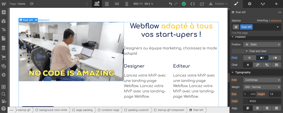
If you want to display text (or another element) next to an image (or another element), you can use floating position.
There are 3 types of float positions:
1. Float None: No effect applies
2. Float Right: The element positions itself to the right of the parent element
3. Float Left: The element positions itself to the left of the parent element
The "clear" parameter allows you to clear this type of positioning. There are 4 types of "clear" parameters:
1. Clear None: No effect, elements are arranged to the right, left or both right and left of parent elements
2. Clear Right: Prevents an element from being positioned to the right of parent elements
3. Clear Left: Prevents an element from being positioned to the left of parent elements
4. Clear Both: Prevents an element from being positioned to both the right and left of parent elements
That’s it! You can now arrange your elements wherever you want in your Webflow site.
If you want to learn more about Webflow's web design features, here’s an article on the Style Manager. You can also contact our Webflow agency for your custom project.


.webp)

.jpg)
