The responsive design has become a standard for creating modern websites, but finding the right method to make your website "responsive" can be challenging.
Fortunately, utilizing Fluid Responsive can greatly simplify this process. In this article, we will explore what Fluid Responsive is and how to use it in Webflow with the help of Finsweet.
What is Fluid Responsive?
Definition of Fluid Responsive
Fluid Responsive is a web design technique that allows a website to smoothly adapt (fluidly) to different screen sizes through proportional scaling.
This technique for web design with flexible layouts that adjust to all screen sizes typically uses percentages instead of pixels to define the dimensions and margins of the page elements.
Unlike fixed designs, which have predefined sizes for each element, "fluid responsive" allows elements to resize and reposition themselves based on the user's screen size. Thus, a website designed with this technique will automatically adapt to all devices, be it a desktop computer, tablet, or smartphone.
Units of Fluid Responsive
To implement a "fluid responsive" design, it’s important to use relative units (percentages, em or rem) instead of absolute units (pixels). This allows the dimensions and margins to be defined based on the viewport size, rather than a fixed size.
It’s also possible to use vw (view width: value based on screen width) and vh (view height: value based on screen height) units. However, there are several issues with this approach:
- All elements must use vw or vh. This leads to many classes and a lot of management.
- If the screen is very large, you can end up with gigantic elements or margins, and vice versa.
- The vw and vh units do not take user preferences into account, which raises accessibility issues.
To create a fluid responsive design, you also need to define breakpoints ("breakpoints") where the page layout will reorganize to fit smaller screen sizes. Breakpoints allow you to set layout rules and styles for each element based on the screen width.
Implementing Fluid Responsive in Your Webflow Project
Contextualizing Fluid Responsive with Client-First and Finsweet
Before we begin, it's important to clarify that there are several methods to implement fluid responsive design in a Webflow project. In this article, we will focus on the best (and likely the simplest) way to do so. This method will follow the principles of Client-First and the tools provided by Finsweet.
If you are familiar with Client-First, you know that when developing a project, we use REM units rather than other size units (understand the difference between REM and Pixels).
In summary, REM is a CSS unit used to define the size of elements on a webpage. Unlike pixels and other absolute measurement units, REM are relative to the root HTML size rather than the parent element's size.
This means that sizes defined in REM will remain proportional to the default font size of the page, regardless of the parent element they reside in. Therefore, using REM is a recommended practice for creating "fluid responsive" designs that adapt to all screen sizes.
By default, 1 REM = 16px, but we can modify this root font size.
That is why for its Fluid Responsive implementation, Client-First utilizes "root-font scaling". This way, we can globally control all sizes in your project.
Generating Fluid Responsive Client-First in Webflow
To generate a fluid responsive design, you simply need to add a CSS code in your project settings. The code can be added at the end of the project once your development is completed and takes only a few minutes to set up.
To do this, you must first install the Finsweet extension for Webflow. Once the extension is installed, you will need to:
- Enter the Designer of your project
- Click on the Finsweet extension icon
- Click on "Client-First"
- Click on "Fluid Design Generator"
- Set up your Fluid Responsive design
Configuring a Fluid Responsive Client-First in Webflow
When you are on the Client-First fluid design generator in Webflow, you have several options for configuring your responsive layout.
Modify Breakpoints
By default, you have 3 breakpoints (479px, 1440px, and 1920px).
Initially, you can remove, add, or modify the default breakpoints.
- To add a breakpoint, you can click on the plus icon between the existing breakpoints.
- To remove one, hover over a breakpoint and click the red cross next to it.
- To modify, simply click on the value of a breakpoint and change it.
Change Root Font Size Values by Breakpoint
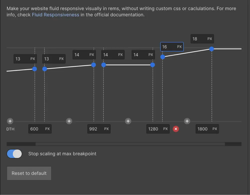
After modifying your breakpoints, for each of them, you can set the starting root font size and its ending value.
For example, if we have a breakpoint at 1920px and another at 1440px, we can define that at 1920px, the root font size is 18px (instead of the default 16px) and at 1440px it's 16px.
Thus, between 1920px and 1440px, the value of 1 REM will linearly decrease from 18 to 16px. This means that at 1680px, 1 REM will equal 17px, or at 1560px, 1 REM will equal 16.5px.
In short, we can vary the size of a REM based on the screen width through our defined breakpoints and linear gradients.
Another example of a custom Fluid Responsive:

Additional Options
The generator offers additional options to enhance your setup:
- Stop Scaling at Max Breakpoint: to maintain a fixed size after the largest breakpoint
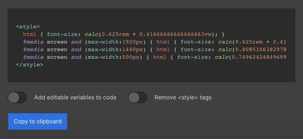
- Add Editable Variables to Code: This allows for easier modification of the values directly in the code later on without needing to return to the generator
- Remove Style Tag: to keep only the pure code without style tags
Integrating the CSS Code
Once your configuration is ready, you can directly copy the code using the dedicated button and integrate it into your project's custom code (in the head tag).
If you want to see the code in action and have a Client-First project, you can insert it in the embed of the Global Styles component (otherwise, you will need to publish the project).

css code fluid responsive client-first webflow
Benefits of Using Fluid Responsive with Finsweet
- You have the freedom to implement or not implement it in a Webflow project
- No constraints regarding development
- Easy management
- Accessible
Conclusion
In conclusion, we see that Fluid Responsive is an effective web design technique for making websites "responsive". Thanks to Finsweet, it’s easy to add this technique to any "Client-First" Webflow project without the need for complicated calculations or custom CSS. So if you’re looking for a simple method to make your website "responsive", give Fluid Responsive with Finsweet a try!


.webp)

.jpg)

%20(1).jpg)
