Responsive design is not an option for your website. And yet...
Maintaining the correct aspect ratio of your images when they are resized through responsive dynamics can be quite a challenge.
That's why, in this article, we discuss a simple method (involving a little math) to preserve the original aspect ratio of your images on Webflow, ensuring they won’t be cropped or distorted, regardless of the device used.
The importance of aspect ratio in responsive design: Avoiding cropping issues
When an image is adapted to different screen sizes, cropping or distortion issues may arise. This fairly common problem compromises the overall quality of the visual. To avoid these issues, it’s best to define the size of your visuals—whether image or video—using ratios.
→ For better responsiveness: favor the use of ratios over fixed sizes (pixels, rem, etc.)
By maintaining the original aspect ratio, we ensure a faithful representation on all devices, thereby avoiding the partial loss of potentially important visual content or the distortion of the image.
How to maintain the aspect ratio of your images in CSS on Webflow?
The ingredients:
- A Div Block
- An image element
- And, a bit of mathematics
The recipe for a 100% responsive image ↓
- Create a div block: In Webflow, select 'Add Elements', then choose 'Div Block'.
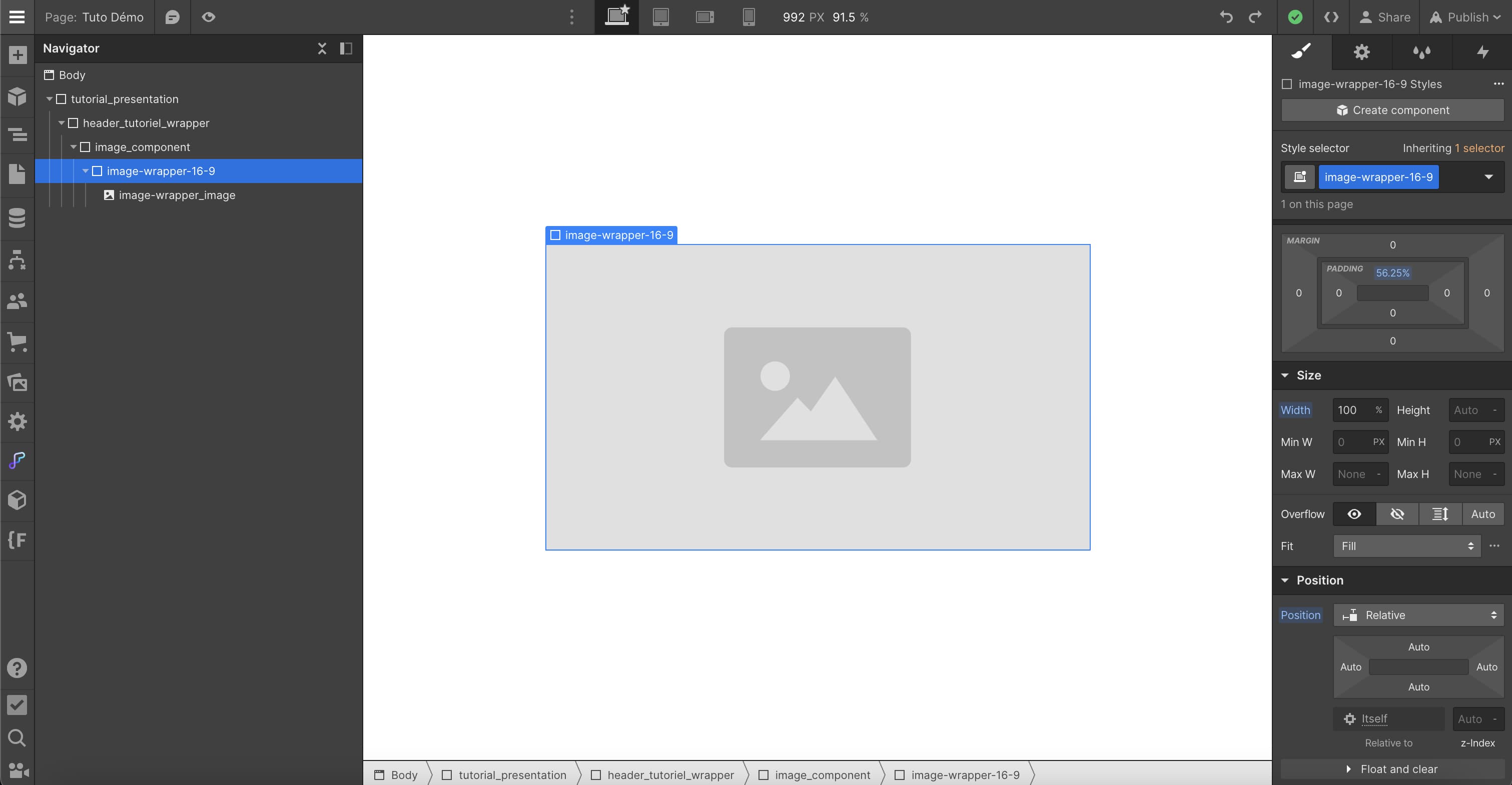
- Set the Div Block position to 'Relative': In the Style panel, set the position of the div block to 'Relative'. This step is essential as it ensures that the image we will insert will have its position defined relative to this Div Block, and not to the entire page.
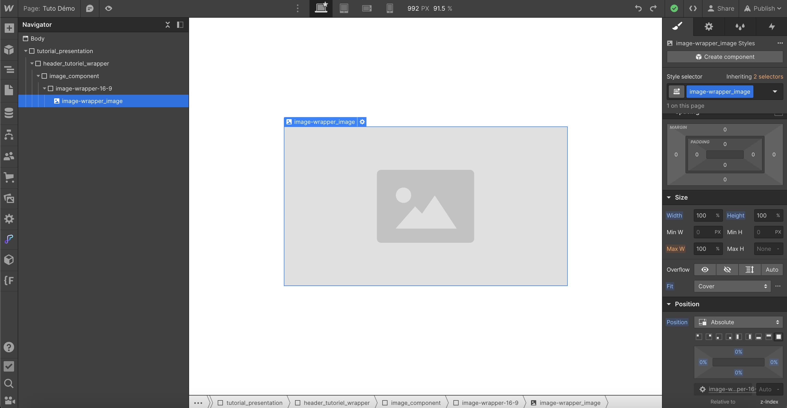
- Add an image: Drag an image into the div block. Make sure to set its position to 'Absolute'. This step, combined with the 'Relative' position of the div block, ensures that the image positions itself relative to the Div Block.
- Adjust the size of the image: To maintain the aspect ratio of the image, set its height and width to '100%' and change its Fit to 'Cover'. The Fit Cover allows the image to adapt to the size of the div block.
- Maintain the aspect ratio of the image: To do this, add a percentage of 'padding' to your Div Block. The percentage you will use depends on the aspect ratio of your image. For example, for a 16:9 ratio, set the padding to 56.25%.
💡 How did we calculate 56.25%? It’s the result of dividing 9 by 16 and then multiplying by 100 to get a percentage. This ensures that the image retains its original aspect ratio, regardless of screen size.
Illustration of the tutorial with images


By following these steps, your images will fit perfectly on any device, without cropping or distortion, while maintaining their original aspect ratio.
🎁 To easily access various UI elements with the most requested image ratios, you can use the Relume Library →
.jpeg)
Discover the Relume Library in video ↗
Bonus - Maintaining the aspect ratio of your images on Webflow - Video Tutorial
For those who prefer a more visual learning format, we have also created a comprehensive video tutorial on the same topic. In this video, we guide you through each step of the process to make your images 100% responsive on Webflow, while preserving the original aspect ratio.
Take a look, and feel free to ask your questions in the comments section if you encounter any issues or need more information.
_______
In conclusion, maintaining the aspect ratio of your images when adapted to different screen sizes is crucial for an optimal user experience on your Webflow site. By following the detailed steps in this guide, you can easily avoid common issues of cropping or distortion of your visuals.
Thanks to the use of div blocks and the CSS positions of 'Relative' and 'Absolute', combined with a simple mathematical rule for the padding, your images will retain their original aspect ratio, regardless of the device used by your visitors. This way, you ensure the quality and effectiveness of your responsive design.
Remember, responsive design is not an option, but a necessity in the digital age. Learn more about responsive design with this blog article.


.jpg)
