The development of effective mobile websites is essential in today's digital age. However, certain animations that work perfectly on desktop may not have the same impact on mobile. In such cases, you might consider disabling these animations on mobile devices. In this article, we will guide you through the necessary steps to disable a Webflow animation on mobile using the interaction panel.
Step-by-step tutorial to control the activation of an animation on Webflow
Step 1: Access the Webflow interaction panel
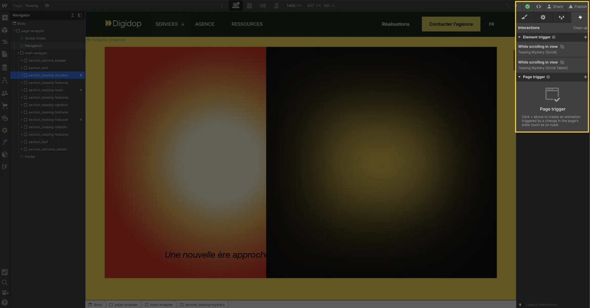
Open your Webflow project. In the upper right corner of your dashboard, look for the lightning bolt icon, which represents the interaction panel. Click on it to explore your interactions.

Step 2: Select the interaction
In the interaction panel, you will see a list of all the interactions you have created. Find the one you want to disable on mobile and click on it to select it.

Step 3: Modify the animation activation settings
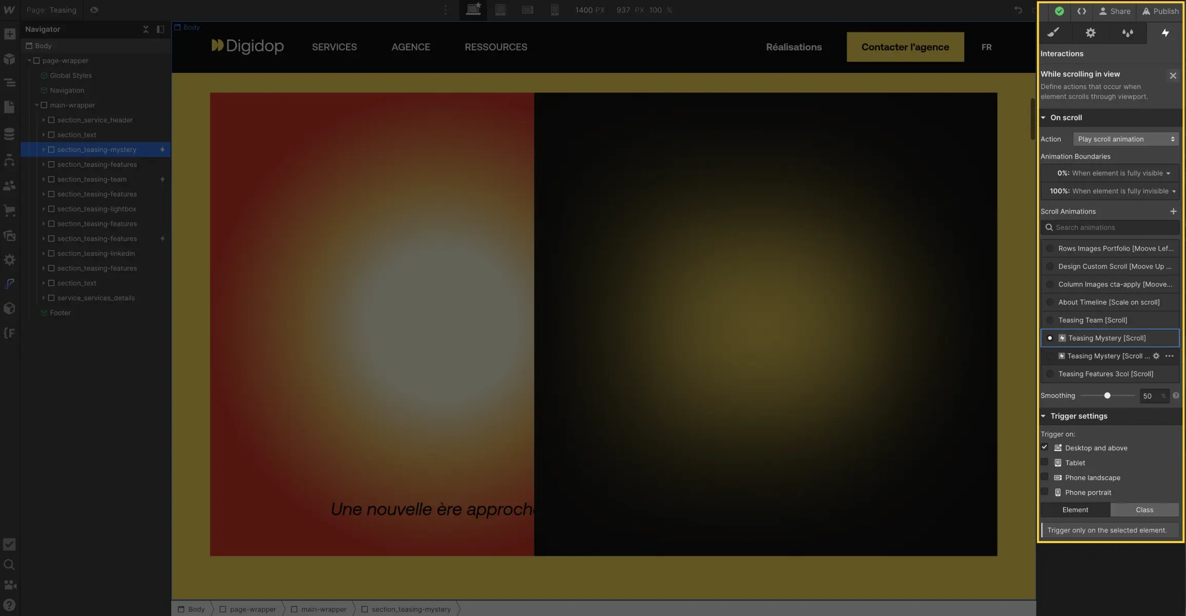
After selecting the interaction, you will see an option called "Trigger settings." This is where you can control when and where the interaction triggers. To disable the animation on mobile, adjust the trigger settings.
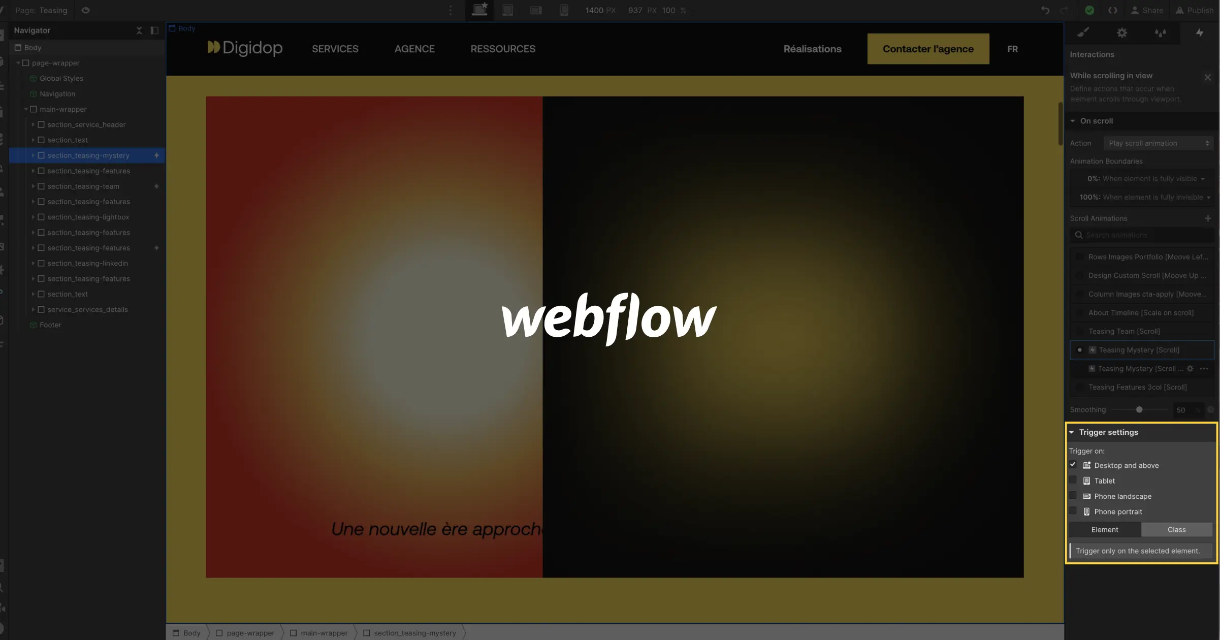
In "Trigger settings," you will find an option called "Trigger on."
Here, you can choose where the interaction will be visible. To disable the animation on mobile, simply uncheck the box for "Phone Portrait."

Conclusion
Webflow offers incredible flexibility to customize the user experience across different devices through its responsive design. The interaction panel allows you to easily enable or disable an animation for the four default formats:
- Desktop and above
- Tablet
- Phone landscape
- Phone portrait
Ensuring that your content displays optimally for all your visitors. Learn more about responsive website development in this article from our Webflow expert agency.
If you found this article helpful, please share it. To learn more about Webflow, explore our resources:


.jpg)
