Building in Webflow for the first time can be quite challenging. Having a foundational understanding of HTML and CSS will be immensely helpful, but not everyone is familiar with these languages. HTML is used to build the structure of your page, while CSS pertains to the design and styling of the elements within that page.
Today, we will present to you the structure that each of your sections should have to develop a clean website or web page on Webflow.
What is a Div?
Before diving into the details, let’s first explain simply and quickly what a div represents. A div, or division, is an HTML element that contains content. A div allows you to group different types of content (such as text, images, videos, or others) within a container. By creating multiple divs, you can define different types of content more effectively.
A div can be styled in various ways (through CSS) to arrange its content.
It’s also worth noting that you can nest multiple divs within a single div (creating stacks of divs) to contain and organize elements.
The Div Structure to Follow for Your Sections in Webflow
In Webflow, we can easily add divs to our project. For each of our Webflow sections, we can stack 4 div blocks that will always be useful.
P.S.: We highly recommend cloning the “Client-First” project from Finsweet before starting your project. Since some classes are already created, this will save you time in developing your sections.
1. Div Block: Section
This first div block is essential because it will contain all the elements of your section. Once you insert it into your project, you can assign it a class, such as section-home-header. You can then apply specific styles, such as a background color.
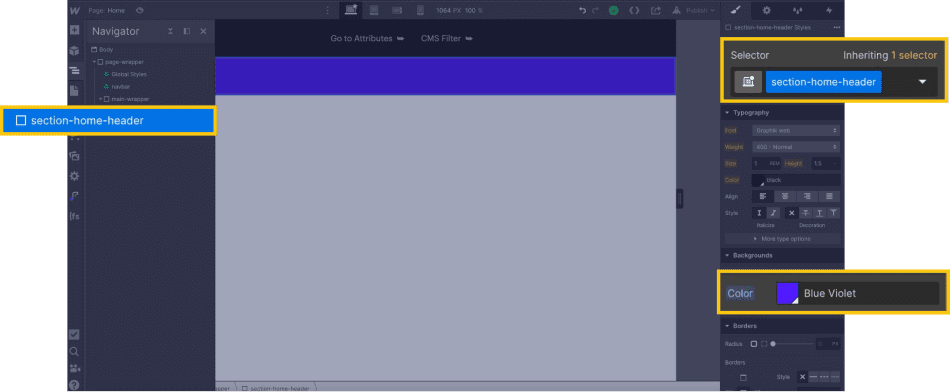
2. Div Block: Padding-global (e.g., Page Padding)
Next, we will add a div block that will provide padding to our section to prevent the elements inside it from being too close to the edges. Inside the section's div, we will add a new div with a class we will name “padding-global”. Then, we will set a value for the padding in the style manager.
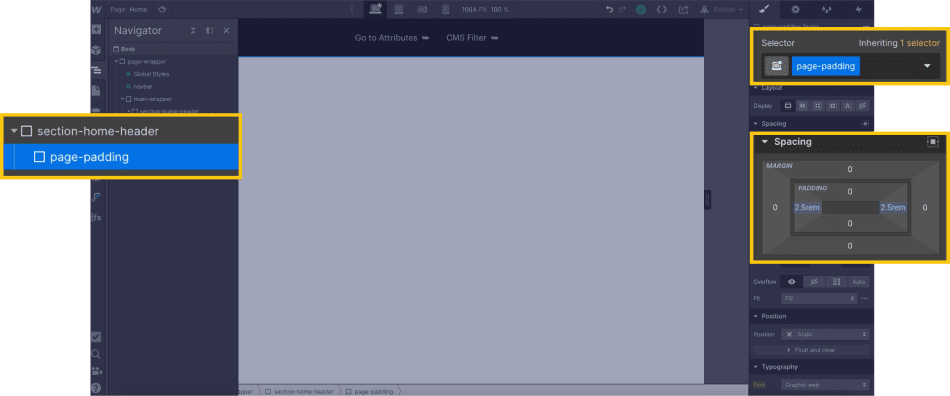
3. Div Block: Container
Next, we will create a new stack. We will insert a new div to hold our content in a container. This will help keep the content centered and within a designated space, even on larger screens.
We will add a div that we will call “container-large”. Then, we will style it by adding auto margins on the left and right to center the div, a width of 100% to take the full width of the div, and finally, a max-width of 80rem to keep the content within a defined space.
Why use REM instead of pixels?
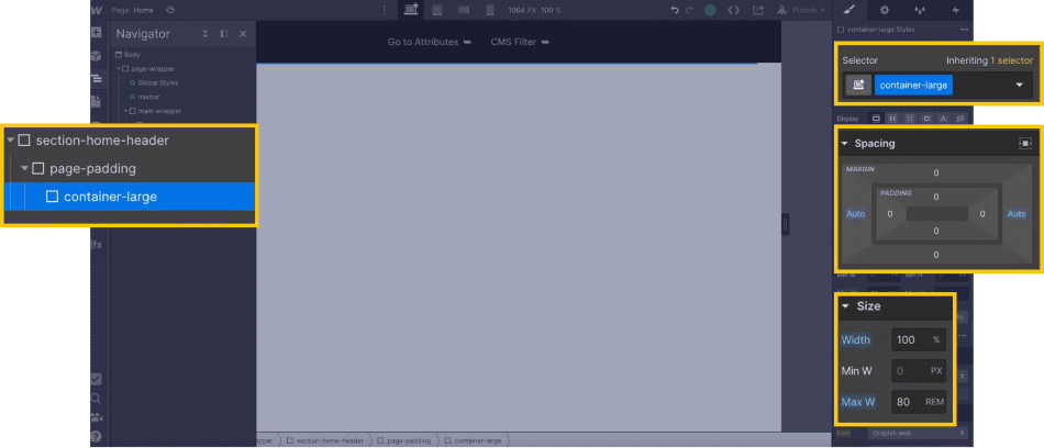
A concrete example of the importance of a container on a website:

4. Div Block: Vertical Padding (Now Section Padding)
After our container, we will add a new div block that will manage the vertical spacing of my content inside my section. Similar to the page padding, the vertical padding will allow you to give space to your section by leaving a "gap" before moving on to the previous or next section.
Once again, we will add a div that we will style. We will name our div padding-vertical. If you haven't cloned the default Client-First style guide, you'll want to set a padding of 0rem on the left and right.
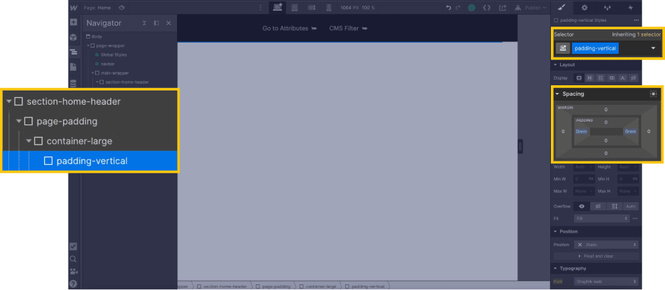
You will then add a combo class, for example: “padding-custom1,” and set a value for the top and bottom padding.
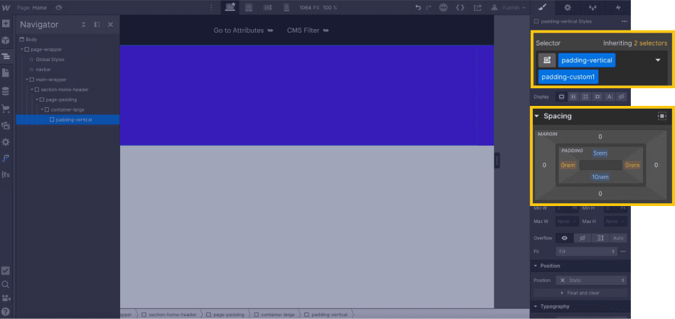
After following this stack of div blocks, you can add new HTML elements from Webflow to arrange your section.

You can now add this div stack every time you create a new section to maintain an optimized structure.
If you need to revamp your Webflow site, our expert agency can assist you!


.webp)


.jpg)
