1. Components, Variants, and Instances: What Are They?
1.1 Components
Components are reusable design elements in Figma. They can be used to create consistent and uniform user interfaces (UI). For instance, if you need to create multiple buttons in your UI, you can create a button component and reuse it in several places throughout your project. This allows you to maintain UI consistency and facilitates future changes, as you only need to update the component once for it to apply across the entire UI.
1.2 Variants
Variants are modified versions of a component. They can be used to display UI elements differently based on state or condition. For example, you might create a variant of a button for the active state and another for the inactive state.
1.3 Instances
Instances are copies of a component distributed throughout your design. They are directly linked to the main component, and any modifications made to the latter will automatically apply to each instance. You can customize instances using the various properties of the variants.
By using Figma's components, variants, and instances, you can create more efficient and flexible UIs, as you can easily update and reuse UI elements without having to recreate them each time. This can save you time and effort when designing complex UIs.
2. Creating a Component

- Select the design element you wish to convert into a component. This element can be any design item in Figma, such as a rectangle, a circle, text, or a UI element you have designed.
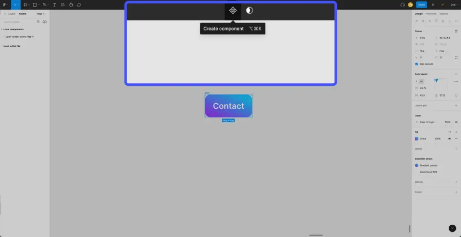
- In the toolbar, click on the "Create component" button.
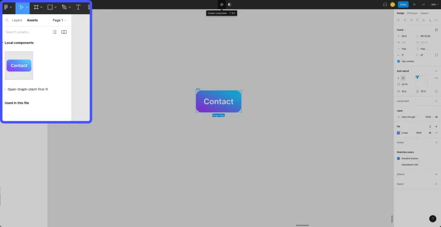
- You can now access your component from the Layers panel and use it by dragging and dropping it into your UI. You can also reuse it in other Figma projects by sharing it in your Figma library.
It's important to note that any changes made to a component will apply to all instances of that component in the UI. This means that if you modify the main component, all instances of that component in the UI will be updated accordingly. This can be beneficial when you wish to make quick and consistent changes to the UI, but if you want to customize your instances, you'll need to create "properties": Text, Instance Swap, Boolean.
3. Creating Variants

3.1 Adding a Variant to Your Component
- Select the component for which you want to create a variant. You can do this by clicking on the component instance in the UI or from the Layers panel.
- In the toolbar, click on "Add variant."
- Name this variant in the right panel under "Current variant." This helps to differentiate the variants from one another.
Once your variant is created, you can add several types of properties to differentiate and customize them in your Figma project.
Unlike components, changes made to a variant will only apply to that specific variant of the component. This means you can use variations to display UI elements in a personalized way based on state or condition without affecting other instances of the component in the UI.
3.2 Adding a "Text" Property
The "Text" property allows you to customize a text element on a component variant. You will be able to change the text of all your instances (the variants spread across your UI) depending on the situations.
- Select your component
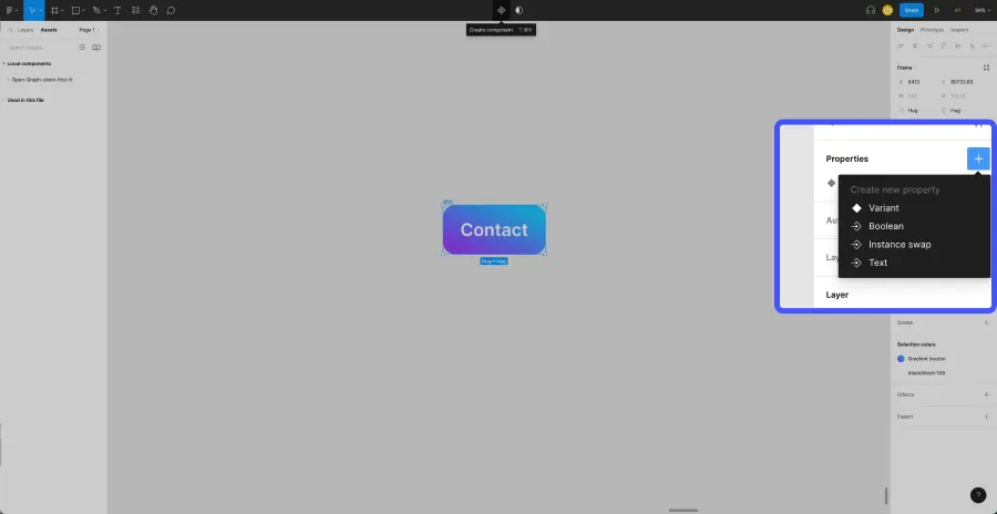
- In the right panel, under "Properties," click on "Create new property."
- Click on "Text."
- Name your new property and set a default value.
- Select the text box of a variant.
- Go to the right panel, under "Content," click on the "Apply text property" icon and then connect the property you just created.
You can now customize the text of each of your instances through this new property.
3.3 Adding an "Instance Swap" Property
The "Instance Swap" property allows you to incorporate other types of components into your variants. For example, you could connect an icon from your component to a component bank of "Icons." This will enable you to customize the icon of your variants easily by retrieving it from the icon bank.
- Select your component
- In the right panel, under "Properties," click on "Create new property."
- Click on "Instance Swap."
- Name your new property and select the component you wish to connect.
- Select the component that you connected to your variants.
- Go to the right panel and connect the property you just created.
You can now customize each of your instances by retrieving elements from another component bank.
3.4 Adding a "Boolean" Property
The "Boolean" property allows you to add the ability to show or hide an element of the component. For example, in some cases, you may want to show an icon on a button, and in other cases, you prefer to hide it.
- Select your component
- In the right panel, under "Properties," click on "Create new property."
- Click on "Boolean."
- Name your new property and select a default value (initially assigned to all variants): True or False.
- Select the element you wish to show or hide.
- Go to the right panel and connect the property you just created.
You can now use the On/Off toggle on each of your components to show or hide the element.
4. Adding an Instance

You can easily add copies of your main component, also known as "Instances," from the Layers panel (on the left). Select the component and drag and drop it onto your Figma.
Take it further with our FREE Figma & Web Design Training


.webp)


%20(1).jpg)
.jpg)
