On the web, there are both links AND buttons for a good reason! Each of these HTML elements has its own context of use. In this article, I will explain:
- Why it's important to know when to use a link or a button in HTML.
- The technical difference and best practices for using links and buttons.
- How to work around the issue of "fake" button elements if you are using the Webflow CMS.
1. Why is it important to understand the difference?
If you want to implement best web practices on your website, there are at least three good reasons to use the "a" vs "button" semantics correctly:
1.1 Improved accessibility:
- Enhancing the user experience for individuals using assistive technologies.
- Simplified keyboard navigation, essential for users unable to use a mouse.
1.2 Optimization of HTML semantics:
- Better understanding of content by search engines, which can enhance natural referencing (SEO).
1.3 Compliance with web standards:
- Adhering to W3C standards, ensuring better compatibility across different browsers and devices (computers, tablets, mobiles).
In summary, the correct use of "a" and "button" elements enhances your website's accessibility, the quality of your semantics, and complies with web standards. At Digidop, a Webflow agency specialized in SEO, we believe that SEO is also a matter of "common sense" and, therefore, that integrating these best practices on your site can positively impact its indexing on search engines like Google.
Learn more about SXO and how SEO works logically.
2. Link vs Button: The Simplified Guide
ℹ️ Note: I will skip the "technical" aspects related to the use of different elements (ahref, focus, anchor, etc.), which are generally built-in features in all modern CMS like Webflow, WordPress, or Wix.
Without delving into technical details, we will focus in this second part on specific use cases for each element and answer the question:
→ When should I use a link or a button?
1.1 Links ("a")
Primary Use: Links are primarily used for navigation. They are intended to direct the user to another page or a different section of the current page.
Best practices (SEO & Accessibility): The link text should be descriptive and clearly indicate the destination or function of the link.
1.2 Buttons ("button")
Primary Use: Buttons are used to trigger an action (on the same page), such as submitting a form, opening a modal, or activating a JavaScript function.
Best practices (Accessibility): The text on the button should clearly indicate the action it will trigger.
⚠️ Two specificities related to buttons
- No href attribute needed: Buttons do not require the href attribute.
- Use "<button type="submit">Action</button>" for actions like form submission.
1.3 [In brief] The main distinction of use:
The main distinction to remember when using the "a" and "button" elements is behavioral:
→ Links move to another resource while buttons trigger an action on the same page.
2. How to use them correctly on Webflow?
If you are writing your code "from scratch," you now know that you need to be vigilant in writing your HTML. But if you are using no-code or low-code tools, how can you use the semantics of "a" and "button" correctly?
Let’s dive into the Webflow case!
2.1 The "problem" of Link and Button elements on Webflow
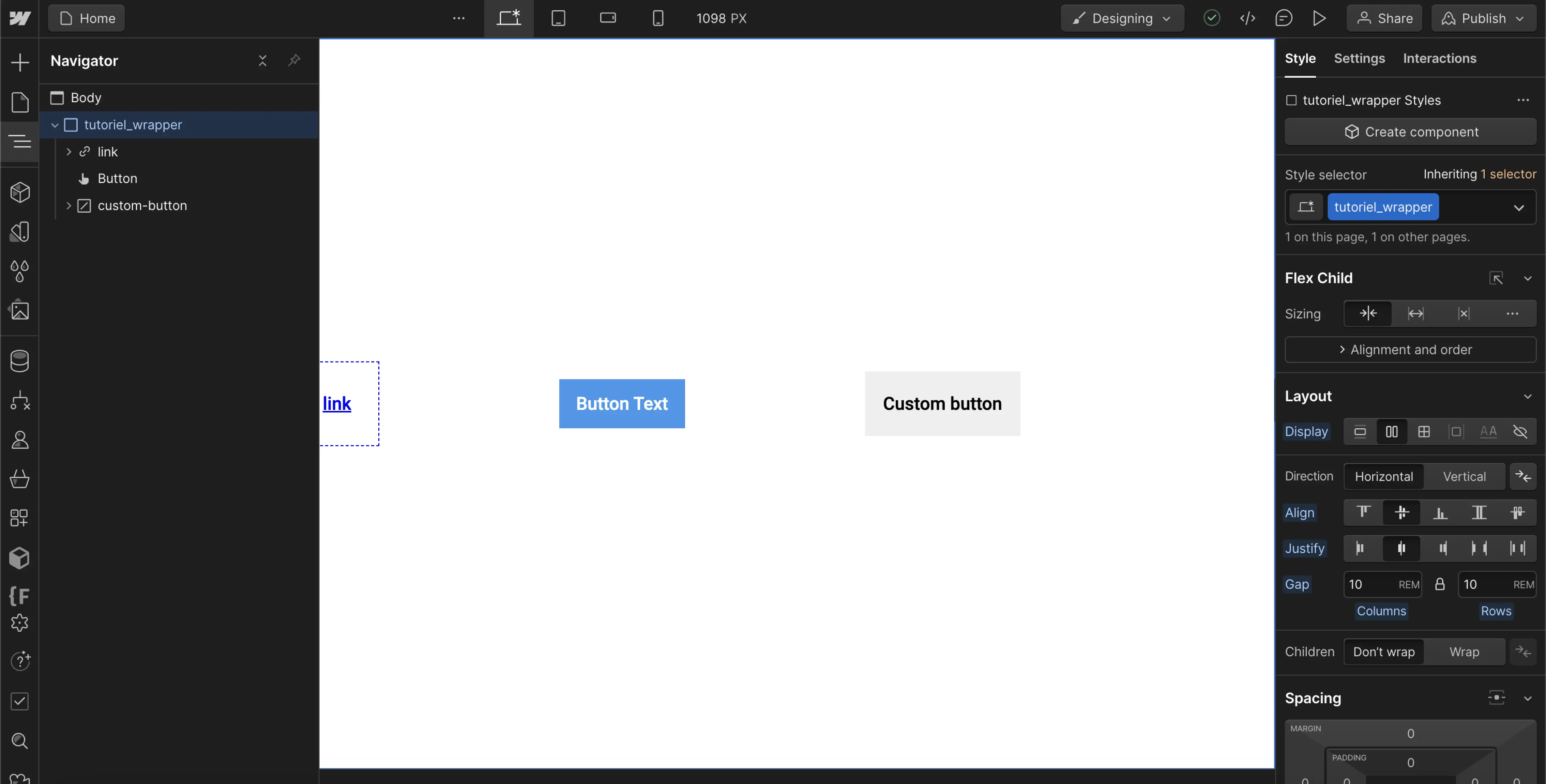
On Webflow, when you use the "default" elements offered by the tool - the Link or Button - there is a small issue.
The two elements actually have the same HTML markup = "a" (See screen reader image). And as mentioned earlier, this does not address accessibility challenges or best practices recommended by browsers in 2023.


Fortunately, there are two solutions to fix this issue.
2.2 [Option 1] Use attributes:
Using an aria attribute allows you to provide additional indications to browsers when reading your HTML code. You can therefore "change" the role of an element by adding new information.
Adding aria description values to define the roles (types) of Link & Button elements is a working solution for search engines to correctly differentiate them. This is, for example, what Webflow does with its "Button Submit" for forms.
In short, this is a solution that works... but is not optimal. Because it is now possible to do this without adding manual tags or using aria attributes by natively creating a real HTML button.
Learn more about Aria Labels →
2.3 [Option 2: Recommended] How to create a "real" "button" on Webflow?
[This option is our recommendation if you want to use a button to trigger an action on your page, such as opening a pop-up.]

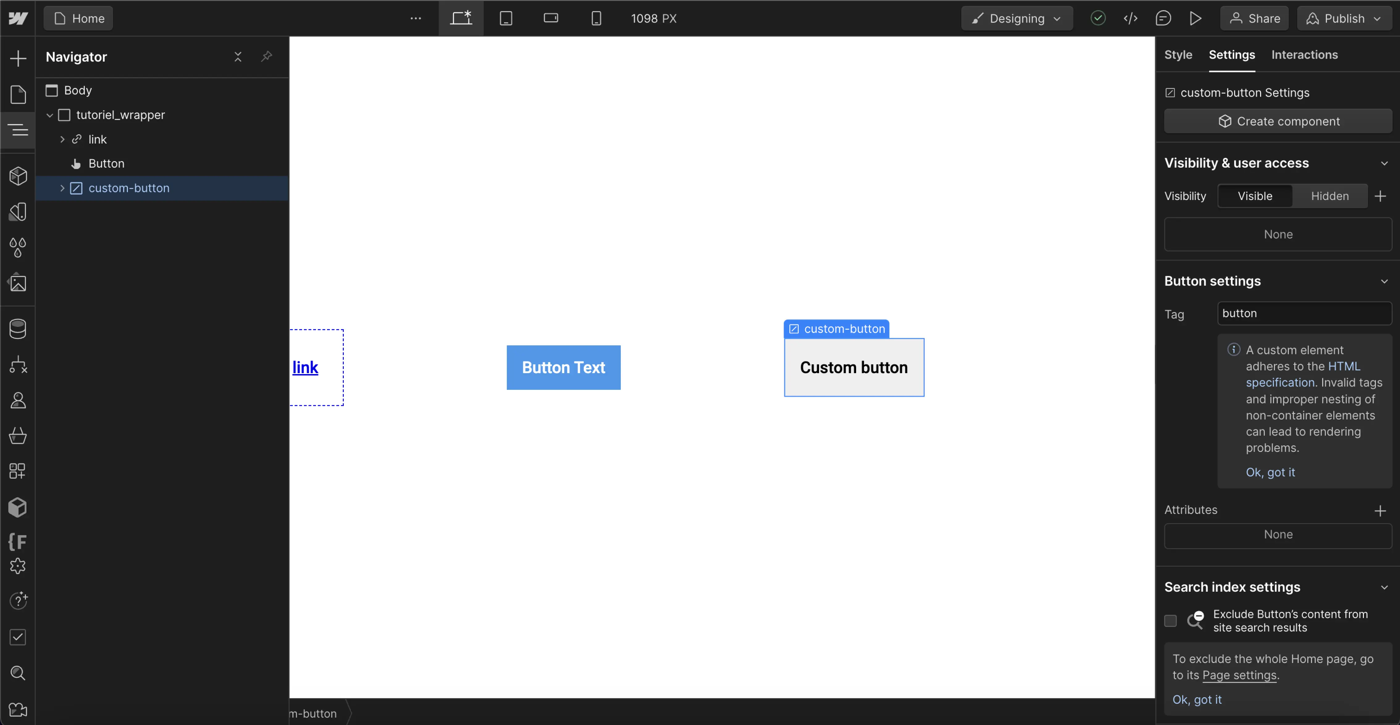
To create a button using the best HTML practices "button" on Webflow, you will need to use an alternative to Link & Buttons: the DOM element "Custom element".
With Webflow's Custom Element, you will be able to develop your own HTML semantics in just a few steps.
→ Creating a "button" on Webflow:
- Add a Custom Element to your project.
- Access its Settings.
- Change the Tag of the element: Div → Button.
And there you go!
And to go further:
- Add a CSS class to the element to style it (design) as you like.
- Add a trigger to your element to activate a JavaScript animation with this button.
- Or define its type following W3 recommendations
Conclusion
Links are to be used to move users to a new "location" (navigation action) while buttons serve to trigger an action (on the same page). Using the correct HTML element enhances the overall accessibility of your website.
If you use Webflow, the default button element does not actually have the correct HTML semantics, but you can customize the "role" of this link using Aria attributes - or - you can create a button with the proper HTML semantics using the custom element (DOM element), then customize its style using CSS classes.
Bonus: More Resources?
To learn more about web design and new tools, discover our free resources:
- Newsletter →
- Digidop YouTube Channel ↗
- 3 use cases to improve the quality of your developments with Webflow's new DOM element → (Coming soon)


.jpg)
