Figma is a design tool created to build all types of web interfaces: websites, landing pages, applications, web apps, platforms, etc. As an alternative to Sketch or Adobe XD, Figma boasts numerous features tailored for both designers and web developers. This collaborative tool aims to reconcile and simplify the workflow of all teams for optimal results.
Finding a common language between design and development
The challenges of web projects often arise during the transition of the design mockup to development. The tools and working methods can be vastly different, and developers require information related to CSS, Swift, XML, and JavaScript. It has thus been crucial to learn to standardize and harmonize these working methods over time to optimize everyone's work.
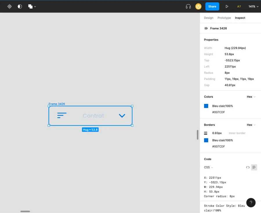
Regarding Figma, the tool supports and provides access to the CSS, Swift, and XML codes of each element. From the coding panel, developers can access detailed information on each graphic element they select: pixel in X, Y, W, H, corner radius, constraints, background, HEX code, margin measurements, etc. These features facilitate the "pixel-perfect" development of each design and mockup.
Web prototypes that closely resemble the final version
Web design is not static! From simple interactions with buttons for navigating between pages to 3D animations, movements are multiplying across the web. While the trend leans increasingly towards "accessible sites" with minimal animations, every mockup involves interactions that designers must convey to developers:
- Understanding the website's internal structure
- Button animations based on states
- Dropdowns
- Scroll animations
- Tabbed panels
- etc.
The prototyping phase addresses this need, as it is the most representative stage of the final interface design. It includes the structure derived from UX, all the graphical elements from the UI phase, and the option to interact with the mockup.
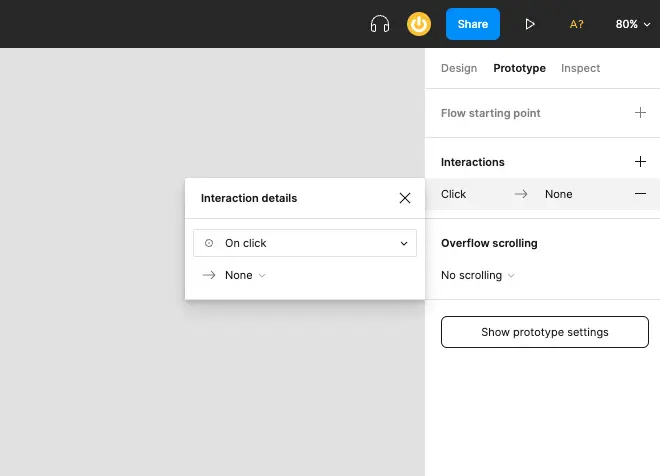
Figma has a configuration panel specifically for creating web prototypes. It allows users to add interactions to each visual element and then test and visualize these animations in Figma's presentation mode.
Optimized design system with components and styles
Creating styles and components in Figma is a way to centralize all elements related to the design system.
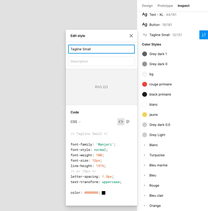
Styles allow developers to access all information regarding colors, texts, effects, backgrounds, grids, margins, etc. used in the mockup with just one click. The code associated with each style is therefore accessible from a single interface.
Figma components enable users to one-click access to the master element of a design and all its variants.
These are two very useful features that will complement and standardize the style guide for developers.
Figma features dedicated to developers
A list of Figma’s features exclusively focused on developers.
Code Inspection
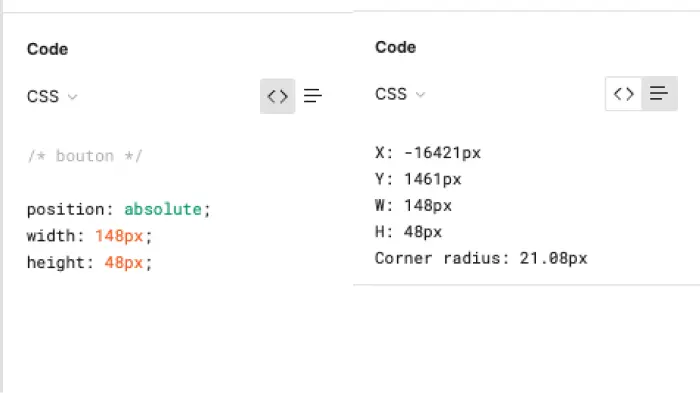
As mentioned earlier in this article, Figma allows users to access the CSS, Swift, and XML code of each graphic element and copy it with a single click: sizes, typography, color values, etc. JavaScript is not supported by the tool.
The coding panel offers two types of formats:
- Table Format: copy and paste each element distinctly
- Code Format: copy and paste all the code with one click
Margin Measurements
Once the coding panel is activated, Figma unlocks additional features dedicated to developers, such as margin inspection. To find out the position of text within a button, simply click on the text to display the spacing.

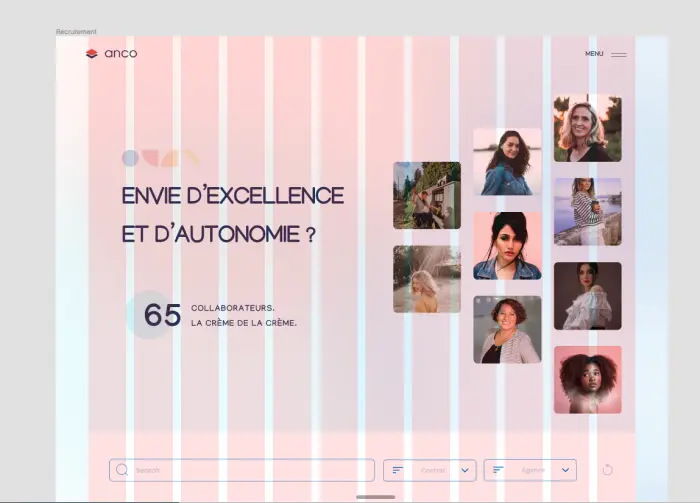
Visualizing Layout Grids
Figma offers several visualization modes based on needs. Developers can activate the layout grids of each frame with a simple Cmd / Ctrl + G.
Accessing Styles
Developers can access all styles for colors, texts, effects, etc., used in the mockup.
Exporting PNG, SVG, CSS
Figma allows the export of graphic elements locally or globally within the project.
- Local Export: click on the image, go to the coding panel, and open the "File Name" URL
- Global Export: the keyboard shortcut Ctrl/Cmd + Shift + E lets you export all graphic elements contained in the file with one click.
- Copy CSS, SVG, or PNG: right-click on the element, select "Copy/Paste as," and choose the desired method.


.webp)


.jpg)
