Here’s an overview of all Figma features available within your design files interface. These tools enable you to create web mockups and other design projects.
In this article, we’ve divided the designer features into four main parts.
1. Canvas
The Canvas is the central workspace of Figma’s designer. It’s a 2D background where you arrange all your design elements, such as images, vectors, mockups, illustrations, GIFs, etc.
This background has a finite size from -65,000 to +65,000 on each axis.
2. Toolbar

Figma is a web design tool primarily designed for creating web mockups. The toolbar includes several features suited for these types of projects, many of which are also accessible via keyboard shortcuts.
Figma Menu

Allows you to perform various actions related to the file, its objects, text, vectors, plugins, etc. You can export elements from your file, change views, access plugins and widgets, and more.
Move and Scale

The shortcut "V" gives direct access to the "Move" cursor to select and move elements within your mockup.
The "Scale" tool, accessible with the shortcut "K," allows you to resize elements while maintaining their proportions.
Frame and Slice

The Frame defines an area for designing, accessible by pressing "F."
The Slice, available with the "S" key, lets you define sections of the canvas that can be exported.
Vector Elements
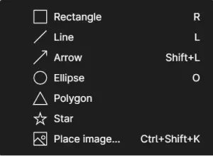
Includes a range of predefined vector shapes you can use to create graphic elements in Figma, such as:
- Rectangles
- Circles
- Arrows
- Lines
- Triangles
- Stars, etc.
Pen and Pencil

These tools let you create vector elements from scratch.
The pen creates vectors with segments, while the pencil allows for fully freehand vectors.
Text

Add text blocks anywhere in your designs.
Manage fonts, styles, colors, etc.
Ressources
NEW !

A new Figma feature, Resources, is now directly accessible from the toolbar, including components, plugins, and widgets.Hand Tool
Hand Tool

Move around the canvas easily without affecting your graphic elements using the Hand Tool.
Comments

Add comments and interact with others on your Figma files.
Components

A feature that lets you turn certain graphic elements into components. Components are “parent” layers with multiple “children.” Each child has the same design properties as its parent. Modify a parent, and all children will adopt the new properties.
Masks and Selections

Two tools that allow you to control the layering of multiple design elements.
Object Editing

Enables you to edit a vector by adding curves, breakpoints, new segments, backgrounds, colors, and more.
Conversation

Start team calls and chat with others working in your Figma file.
Spotlight

Accessible from your profile icon, Spotlight lets you invite others to follow your view on the canvas.
Presentation

Presentation mode lets you display your frames. You can present mockups as simulations on various devices like MacBook, iPhone, tablets, etc.
Share

This feature allows you to share your entire Figma file. You can set restrictions to let people edit or only view the file.
3. Left Sidebar
This area is organized into two columns: Layers and Assets.
Layers
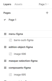
Contains and organizes all the elements on the canvas, such as frames, images, components, instances, groups, vectors, etc. The layers panel also shows how elements are connected.
Assets
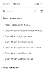
Groups all components created in the document and those shared with the team.
This sidebar also shows all pages within the file, allowing you to organize and create new ones.
4. Right SidebarBarre latérale droite
The right sidebar is organized into three columns:
Design Properties

The first column contains all the properties for the selected elements, such as:
- Position on the X and Y axes
- Width, length, border, and inclination
- Constraints of the graphic element
- Layer properties
- Typography (font family, style, size, color)
- Background (color, opacity)
- Lines (color, width, style)
- Effects (shadow, blur)
- Export options (PNG, SVG, JPG, PDF)
Prototype
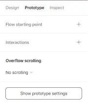
The second column includes all the tools needed to create prototypes in Figma, allowing you to add interactions and animations with graphic elements.
Inspector

The third column is designed for web developers. It displays the properties of elements with their CSS, iOS, and Android code to facilitate the conversion of a Figma mockup into a website.


.webp)

